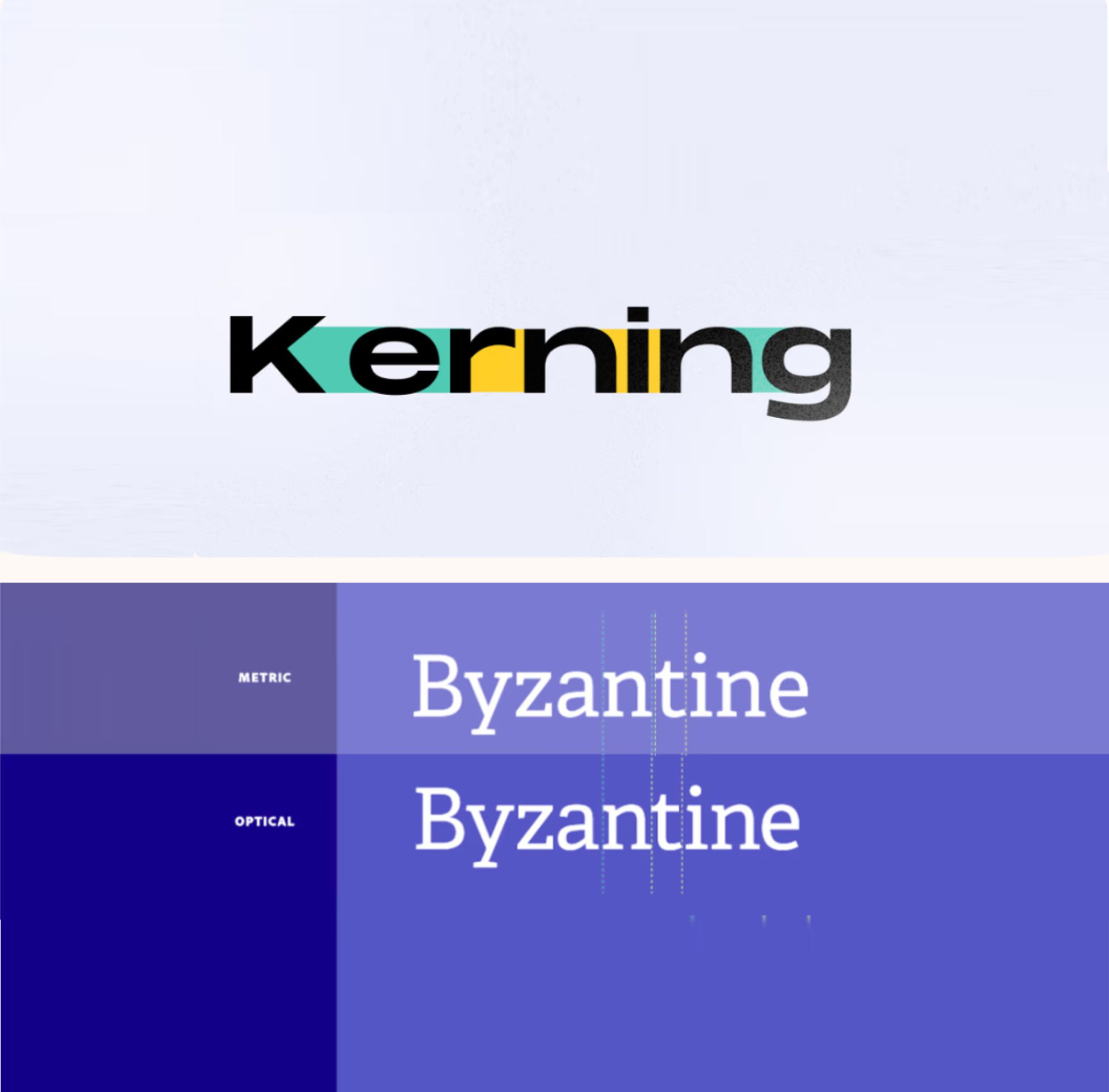
Have you ever felt that something looks off in a text you’re designing? The issue might be kerning. This term refers to the space between two letters (or characters) and the process of adjusting it to achieve visual balance and improve readability. While it may seem like a minor detail, kerning can transform an ordinary design into a professional one.
What Is Kerning and Why Is It Important?
Kerning involves adjusting the space between letters to make the text look uniform and visually appealing. It’s more of a visual exercise than a mathematical one since it’s based on how we perceive space rather than precise measurements. Letters have unique shapes that need to “fit” together like puzzle pieces. Proper kerning ensures smooth readability and prevents awkward gaps from distracting the reader.

Key Tips for Good Kerning
Pay Attention to Tricky Combinations
Certain letters, such as A, V, W, T, and F, can create visually unbalanced spacing due to their angled or extended strokes. Be extra mindful of pairs like “VA” or “To.”
Don’t Overdo It
Spacing letters too closely can cause them to overlap and create confusion. On the other hand, excessive kerning can make text look scattered and difficult to read, especially in smaller sizes.
Focus on Large Text
Kerning is most crucial in prominent text, such as logos, headlines, or titles, where every detail is visible.
Why Kerning Makes a Difference
While kerning may seem like an extra step, its impact on design quality is undeniable. This small adjustment can make text appear more professional, balanced, and readable. So before finalizing your design, take a few minutes to check your kerning—your projects will thank you!
Web Fonts
https://www.canva.com/learn/kerning/?utm_source
Latest Posts
Follow Us

