Typography isn’t just about letters—it’s about presenting text in a way that makes it easy to read, attractive, and impactful. It can shape how people feel about the message you’re sharing. To help you avoid beginner mistakes, here’s a simple guide to key terms you need to know.

Font vs. Typeface
Think of a typeface as the design of the letters you see, and a font as the way that design is delivered. While these terms are often used interchangeably today, they historically had different meanings.
Size
Font size is crucial for creating visual hierarchy, which makes text easier to follow. For example:
- Big sizes for headlines
- Medium sizes for subheadings
- Smaller sizes for paragraph text
Weight
Font weight refers to how thick or thin the letters appear. Thin fonts can provide contrast against bold headers, but they might be hard to read at small sizes.
Ascender
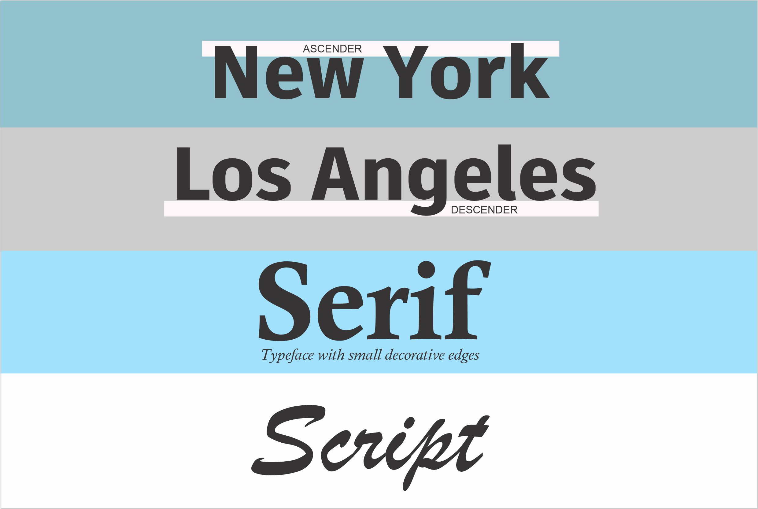
This is the part of a letter that extends above the main body of the text, like the top of the letters “b,” “d,” or “h.”
Descender
The descender is the part of a letter that dips below the baseline, such as the tails of “p,” “q,” or “y.”
Serif
Serif fonts have small decorative edges at the ends of letters. They look traditional and are ideal for longer texts.
Sans Serif
Sans serif fonts don’t have those decorative edges. They’re clean, modern, and great for titles or short text.
Script
Script fonts mimic handwriting, often with flowing strokes. They add a touch of elegance and work well when paired with simpler fonts.
Baseline
This is the line on which most letters sit. Letters like “g” or “y” extend below it.
Tracking (Letter Spacing)
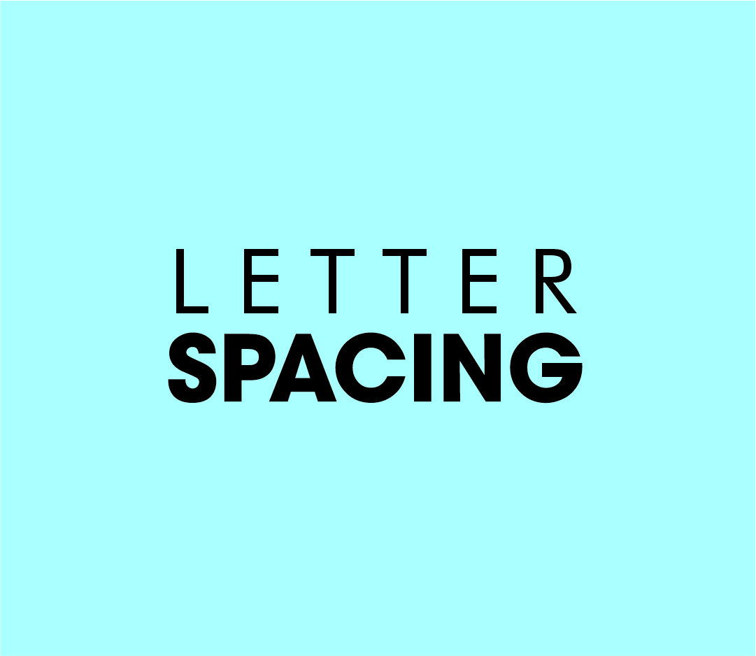
This adjusts the spacing between all the letters in a word, creating a more even and polished look.
Kerning
Kerning focuses on adjusting the space between two specific letters to improve readability and aesthetics.
Leading (Line Spacing)
Leading refers to the vertical space between lines of text. Proper line spacing ensures text is easy to read and visually balanced.
Line Height
This is the total distance from the baseline of one line to the baseline of the next.
Glyphs
Glyphs are the unique characters and symbols in a typeface, like “&” or “*”.
Typography is a practical art that enhances the clarity and impact of any design. Mastering these basic terms will help you create messages that are not only visually appealing but also highly effective.
Latest Posts
Follow Us

