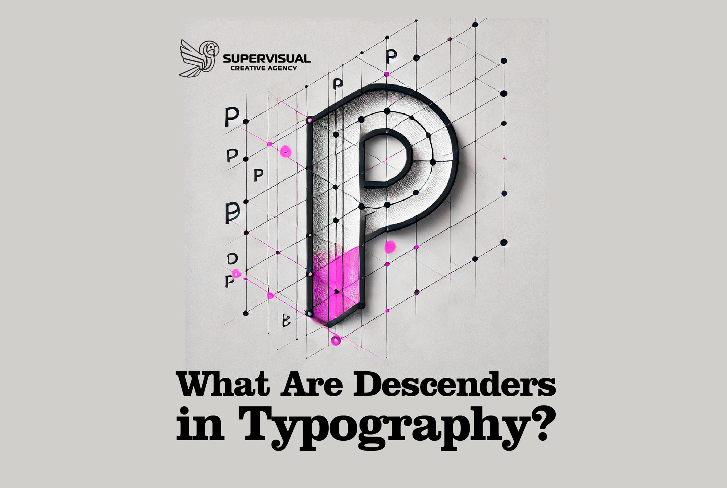
When we look at text, we rarely stop to analyze the shapes of individual letters. However, in graphic design and typography, every detail matters. One such detail is the descender, an essential part of many lowercase letters.
Definition of a Descender
A descender is the part of a lowercase letter that extends below the baseline of the text. The baseline is the imaginary line on which most letters sit in a typeface.
Some letters with descenders include:
✅ ‘g’
✅ ‘j’
✅ ‘p’
✅ ‘q’
✅ ‘y’

Why Are Descenders Important?
Descenders influence the appearance and legibility of text in several ways:
They provide visual balance ⚖️
Like ascenders (the parts of letters that extend upward), descenders create visual rhythm in the text, preventing it from looking monotonous or overly compressed.They enhance readability 📖
Good typography relies on the contrast between ascenders, descenders, and the x-height. If descenders are too short, some letters may become difficult to distinguish. If they are too long, they might interfere with line spacing.They affect text layout ✍️
Subheadings, slogans, or decorative elements often need room for descenders to extend without overlapping with other lines or elements.
Descenders vs. Ascenders
While descenders extend below the baseline, ascenders rise above the x-height (as seen in letters like ‘b’, ‘d’, ‘h’, ‘k’). Together, they shape the visual structure of text, ensuring that words are easily recognizable and pleasant to read.
Descenders might seem like a small detail, but they have a big impact on typography. Understanding their role helps you better appreciate fonts and how they’re constructed. If you’re interested in text design, this is a great concept to start exploring!
Web Fonts
https://www.creatopy.com/blog/what-are-descenders/?utm_source
Latest Posts
Follow Us

