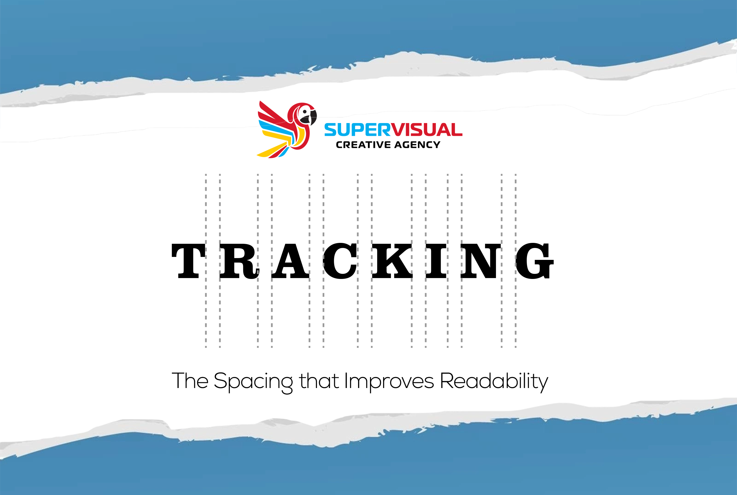
Tracking is a fundamental concept in typography that refers to adjusting the space between all the letters in a word or block of text. Unlike kerning, which modifies the spacing between specific letter pairs, tracking uniformly affects the entire text. Proper control of tracking improves both readability and the overall aesthetics of a design.
Why Is Tracking Important?
Tracking influences the visual density of text. If it is too tight, letters can appear crowded, making reading difficult. On the other hand, excessive tracking can make words feel disconnected and scattered.
Applying tracking correctly helps to:
• Enhance readability in long texts.
• Create a more sophisticated or modern design.
• Balance spacing across different formats, such as print and digital.

How to Apply Tracking Correctly
Here are some practical tips for effective tracking usage:
For body text: Maintain balanced tracking to ensure readability. In longer texts, slightly increasing tracking can improve legibility.
In headlines and logos: Experiment with wider tracking for a more striking and elegant visual effect.
Avoid overdoing it: Excessive tracking can make words look disconnected, while too little can make them hard to read.
Test across different formats: What works in print may not look the same on a screen, so adjust tracking based on the medium where the text will be displayed.
Tracking is a key tool in typography that enhances both the visual appeal and readability of text. With the right adjustments, you can create more attractive and functional designs, ensuring your message is delivered with clarity and style.
Web Fonts
Latest Posts
Follow Us

