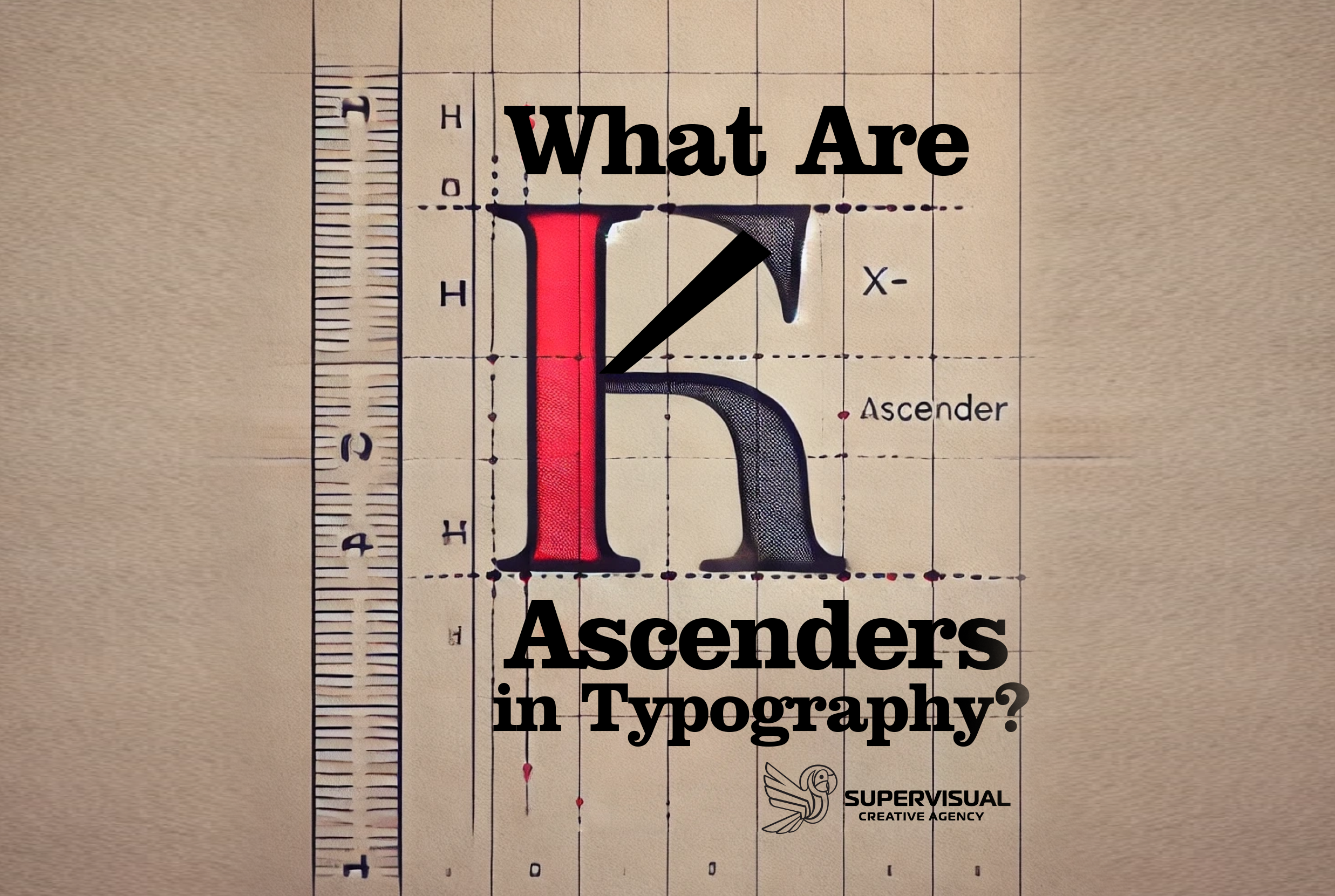
When we read or write, we rarely think about the individual parts that make up each letter. However, in typography, understanding these elements is essential, especially for those interested in design. One key component is the ascender.
What Is an Ascender?
An ascender is the part of a lowercase letter that extends above the main body of the letter. Technically, it is the portion that rises above the x-height of a typeface. The x-height refers to the height of the lowercase letter ‘x’ in a specific font and serves as a reference for other lowercase letters.
Some letters that have ascenders include ‘b’, ‘d’, ‘f’, ‘h’, ‘k’, and ‘l’.

Why Are Ascenders Important?
Ascenders play a crucial role in readability and text appearance. Here’s why:
They Improve Readability 🧐 – Ascenders help distinguish one letter from another, making reading easier. For example, the difference between ‘d’ and ‘a’ is mainly due to the ascender in ‘d’.
They Enhance Visual Harmony 🎨 – The height and shape of ascenders contribute to the visual rhythm and balance of a typeface. They add variety to characters and prevent text from looking monotonous.
They Influence Aesthetics ✨ – Typefaces with taller ascenders can appear more elegant and formal, while those with shorter ascenders may look more compact and modern.
Ascenders vs. Descenders
While ascenders extend above the x-height, descenders are the parts of certain lowercase letters that drop below the baseline (the imaginary line on which most letters sit).
Examples of letters with descenders include ‘g’, ‘j’, ‘p’, ‘q’, and ‘y’. Both ascenders and descenders contribute to the uniqueness and readability of a typographic design.
Understanding ascenders helps us appreciate the details of typography. These extensions not only define the structure of certain letters but also ensure that text remains clear and visually appealing. If you want to dive deeper into typographic design, learning about ascenders is a great place to start!
Web Fonts
Latest Posts
Follow Us

