If you’ve ever seen text with clean, simple letters and no decorative strokes at the ends, you’re likely looking at a sans serif font. This type of typography is extremely popular in graphic and web design due to its modern, elegant, and easy-to-read appearance.
What is a Sans Serif Typeface?
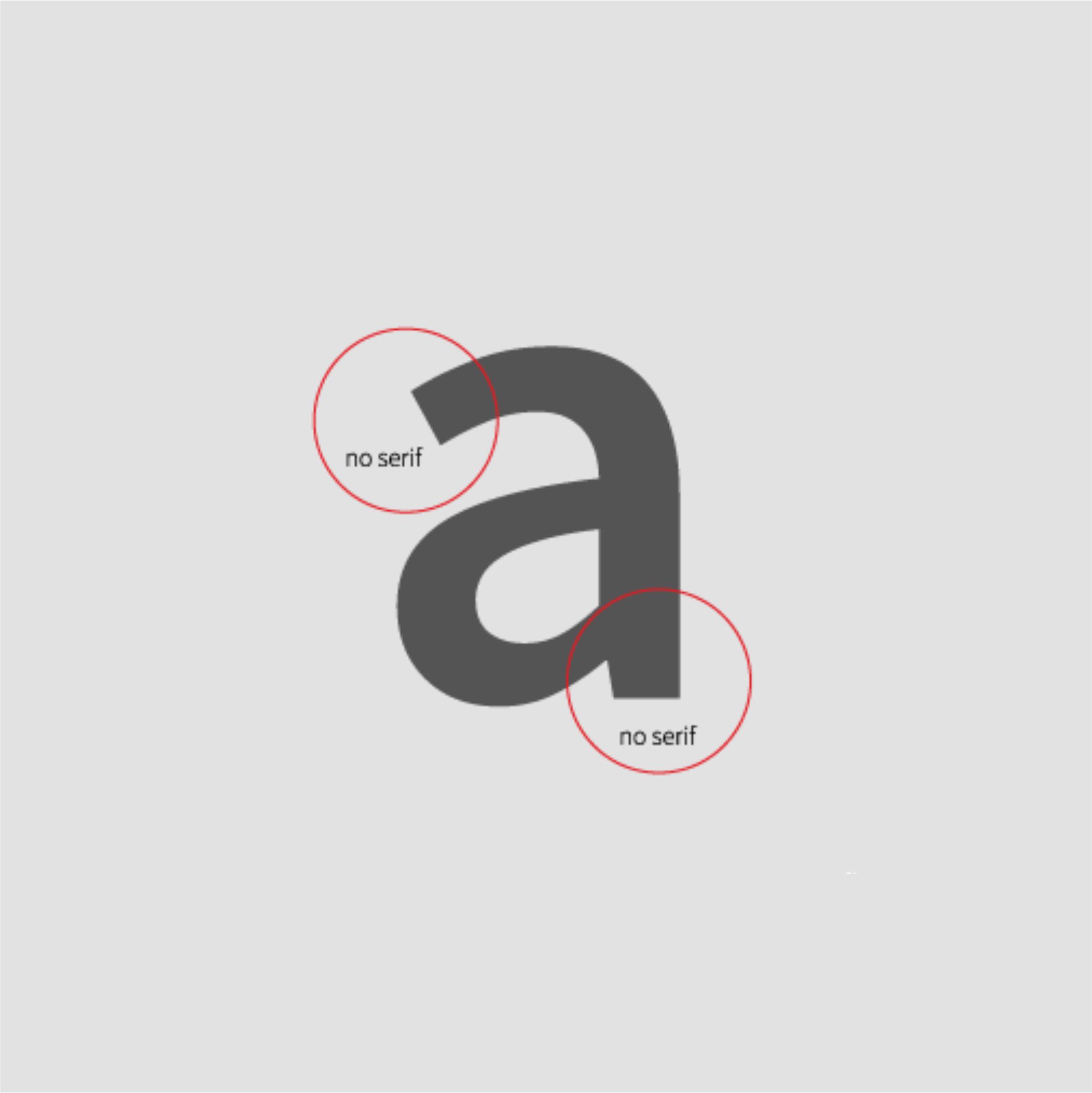
Unlike serif fonts—which feature small decorative strokes (serifs) at the ends of letterforms—sans serif fonts lack these embellishments. This gives them a more minimalist and contemporary look. Well-known examples include Arial, Helvetica, and Montserrat.

Key Characteristics
✅ Clean, modern design: Widely used in branding and digital media for their fresh, up-to-date appearance.
✅ Easy to read on screens: Ideal for websites, social media, and mobile apps.
✅ Versatile: They work well in both bold headings and long blocks of text.
When to Use a Sans Serif Font
✔ Web and digital design: Perfect for improving readability on computer and mobile screens.
✔ Modern and minimalist brands: Common among tech companies, startups, and contemporary brands looking to convey innovation.
✔ Presentations and digital documents: Their clean and direct style makes information appear clear and professional.
When to Avoid Sans Serif Fonts
❌ In long printed texts: For books or lengthy printed documents, serif fonts may offer greater comfort during prolonged reading.
❌ If aiming for a classic or elegant look: For projects that need a traditional touch, serif fonts might be more appropriate.
Sans serif fonts are an excellent choice for digital projects, modern branding, and visually clear content. Their readability and versatility have made them one of the most commonly used font styles in contemporary design.
Web Fonts
Latest Posts
Follow Us

